 |
Elias Ousghir - 2017 Javascript developper & UX designer, with a growing love for data. ousghir.elias@gmail.com GitHub > |
Unemployment rates in France
This unemployment rates visualisation was made for Ouest-France’s online media. It relays on synchronised graphs to show the evolution of each region’s unemployment rate during the last decade. It allows the user to see at a glance how his region compares to the rest of the country.
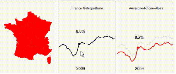
Being an admirer of Mike Bostock’s work, I used the New York Time’s ”Taxe Burden” article as a design reference.
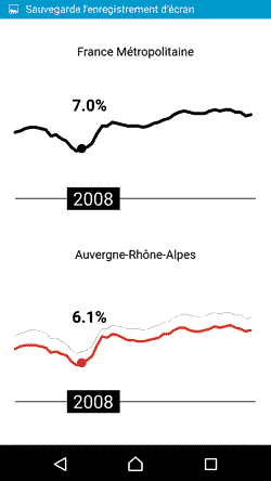
One of the challenges for this project was to allow the graphs to be as accessible on mobile as the desktop version. For a mobile-friendly approach, the graphs are stacked to benefit from a full screen display. The labels are only to be interacted with at a touch on the timeline slider. This way scrolling won’t interfere with the slider:
Semantic graph
Wikicréation.fr is an online encyclopedia abouts art & culture from the University of Paris Sorbonne. My team and I were in charge of redesigning the whole website. I developped the backend as well as a semantic graph, for the front-end. It was meant to display the relations between every article on the encyclopedia.
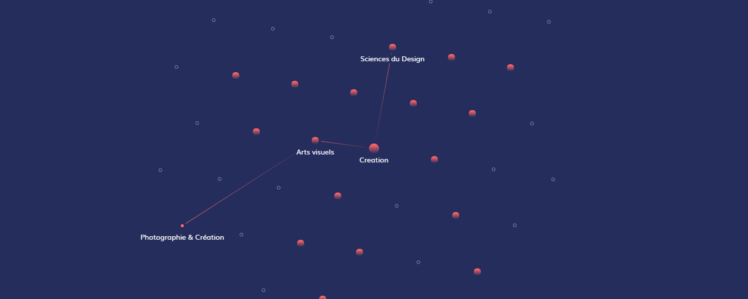
The quincunx matrix shape is obtained by setting a wide collision sphere on each node (in white on the figure below), and forces (in pink) linking the children to their parents. The specificity of this graph is that it reuses the principles of hierarchical graphs, with the difference that a node may have multiple parents.

The back-end consists of a headless wordpress REST architecture, interacting with a front-end based on ReactJs.
Proximeti
geo-contextualized social app

This Android mobile app was thought as a mean of sharing anonymously local things worth noticing. You would use it to publish geolocalized pictures & text to your vicinities. I teamed up with a friend to develop it on our free time.
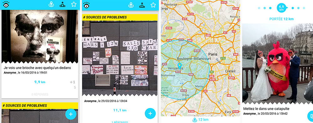
We published it (after 9 months of development including a total redesign after 4 months) and for multiple reasons we simply couldn’t find an active user group. I believe It’s still a project worth mentioning, as It taught me a lot design & development wise.
Squawk 7700
flight’s emergency landings 3d visualisations
The objective of this personnal project was to let planes draw a 3d silhouette of a “panic trajectory“ after an unexpected incident forces them to land.
 javascript, three.js GitHub >
As flightradar provides no API, I used a self-executing web crawler, using node.js and a Raspberry Pi, to constantly scan the sky, and check the transponder codes of every plane on the live interface datasets. If a plane emitted a squawk of 7500, 7600, or 7700, the raspberry waited for it to land before downloading the completed flight dataset.
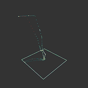 | For example, this flight had to loop back home as an incident occured right after take-off (see the red dots). |
 | This one started descending before declaring emergency. |
Unfortunately this would require a premium flightradar account now, as the website made squawk data unavailable to public. I first used Processing for prototyping, then three.js to display the 3d visualisation in a web interface.
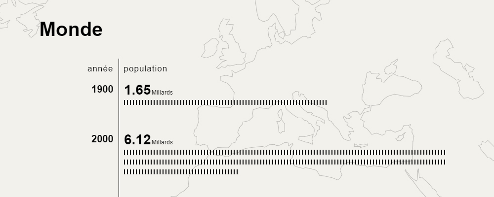
World demographics overview
 javascript, jQuery, d3.js
open interactive >
javascript, jQuery, d3.js
open interactive >
I used this project as personal training for d3.js and different cartographic tools. All the data is displayed on a unique scrollable page, with an animated world map background positioning itself depending on the overlapping data.
Cartographic data from natural earth, demographic data from GeoHive and Pew Search Center.
Illustrations
I used to draw a lot on my free time. Feel free to have a look at my illustrations on this blog.